Nadia & Alf Taylor Foundation
Logo Design | Visual Identity
The Nadia and Alf Taylor Foundation approached us with a clear need: to establish a distinct brand identity that effectively communicates their mission empowering disadvantaged communities worldwide through education. Recognizing the importance of their cause, we were eager to contribute and enhance their visibility, ensuring their mission reaches a global audience.
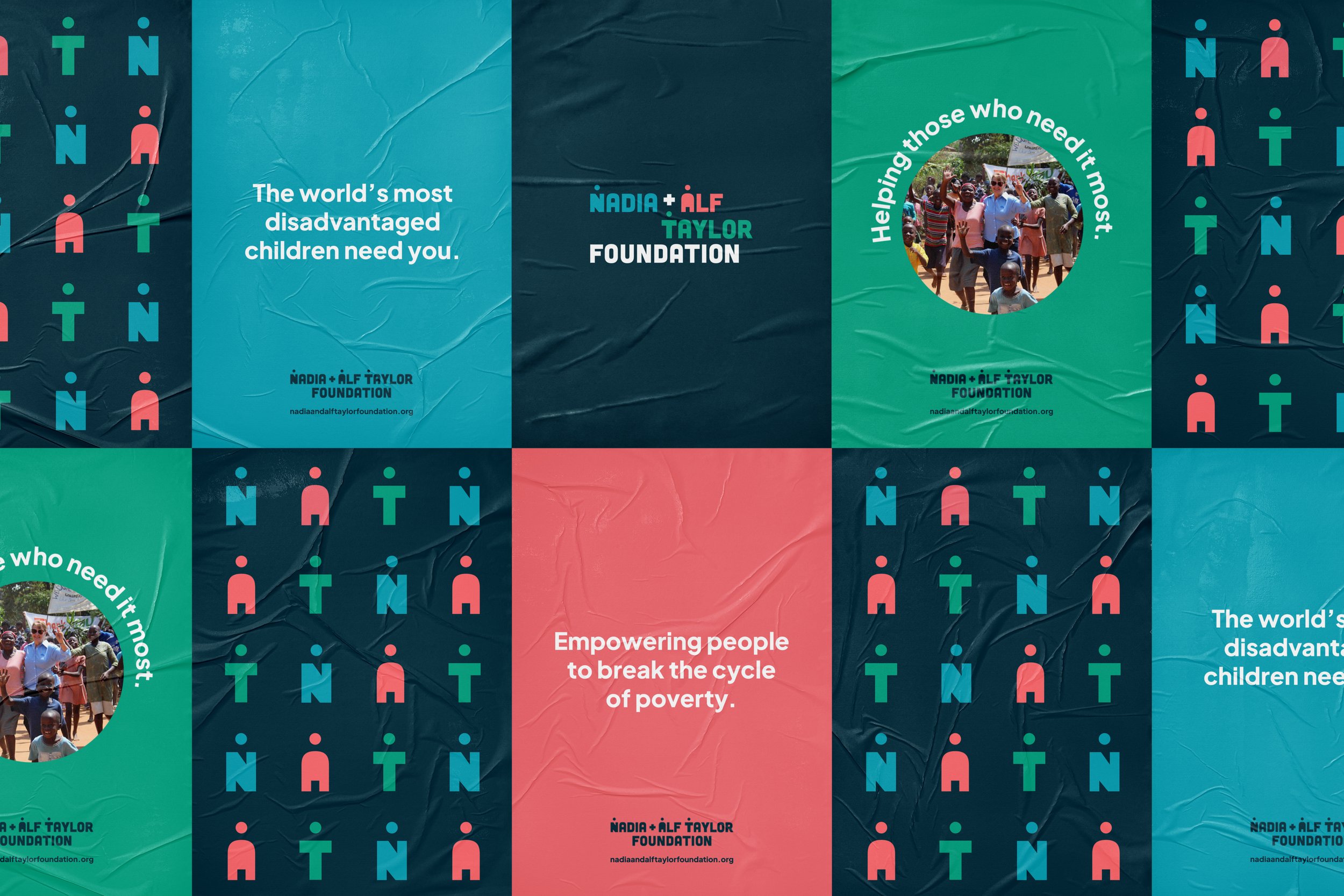
Guided by the foundation's vision, "Global Access to individual prosperity," we aimed to spotlight the individual while showcasing the breadth and diversity of the communities they serve. Our logo design embodies this ethos, seamlessly integrating human forms into the wordmark while maintaining readability. The varied shapes and colors reflect the uniqueness of individuals and communities, resonating well within educational contexts.
Expanding beyond the logo, we incorporated the human forms into a broader brand system, drawing inspiration from African and South-American barkcloth textiles to create patterns. This approach not only appealed to donors worldwide but also resonated with the communities benefiting from the foundation's initiatives.
Designed at Fathom Creative
Design & Art Direction: Bethany Whitlock | Creative Direction: Kat Scott | Project Management: Heather Gregg


