The Milton
Logo Design | Visual Identity | Web Design
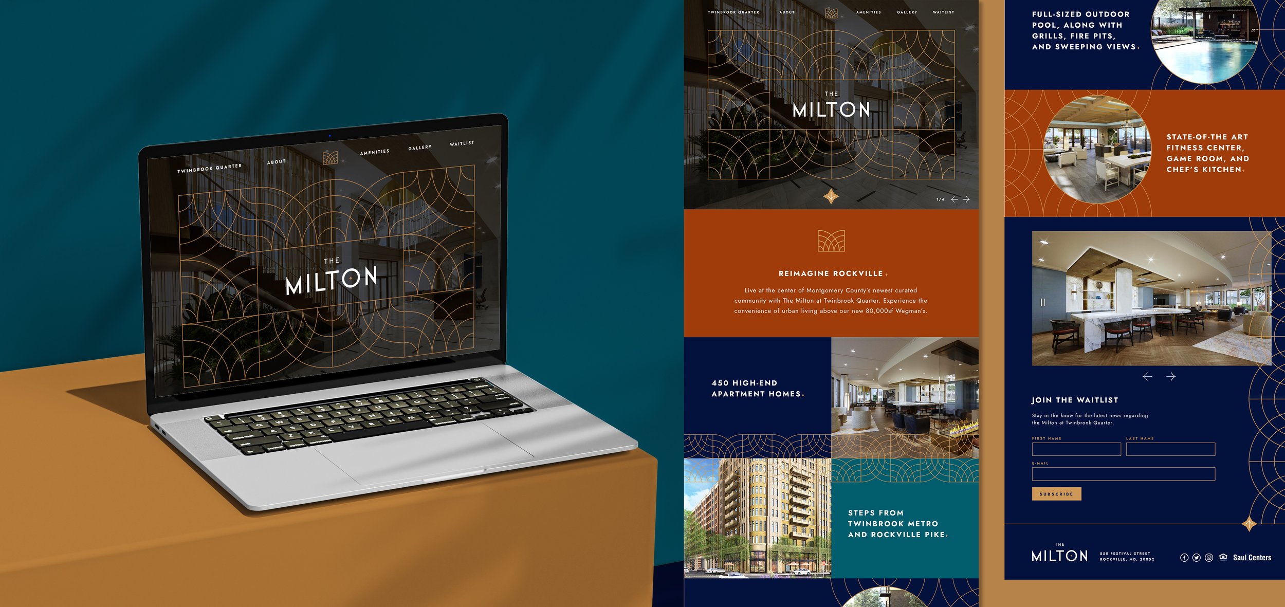
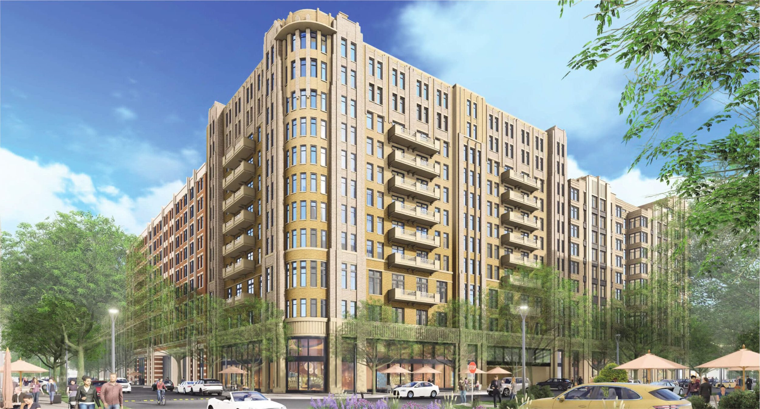
BF Saul needed a fresh new look for their new luxury apartment complex located flourishing area of Rockville, tucked in the D.C. Metro. The building from architecture down to the finished details oozes art deco and extravagance and that needed to be reflected within the brand.
The wordmark is crafted from a super geometric typeface punctuated with a starburst, which is carried throughout the brand. The emblem is an abstracted ‘M’ which expands into a fluid pattern harkening back to the elegant details of the building itself.
Designed at Fathom Creative
Design & Art Direction: Bethany Whitlock | Creative Direction: Kat Scott | Project Management: Heather Gregg


