

USAF Family Advocacy Program
Logo Design | Visual Identity
The USAF FAP reached out to us to breathe new life into their brand, which they felt was a bit distant and outdated. Their mission is about creating and supportive community by offering programs that help Airmen, Guardians, and families.
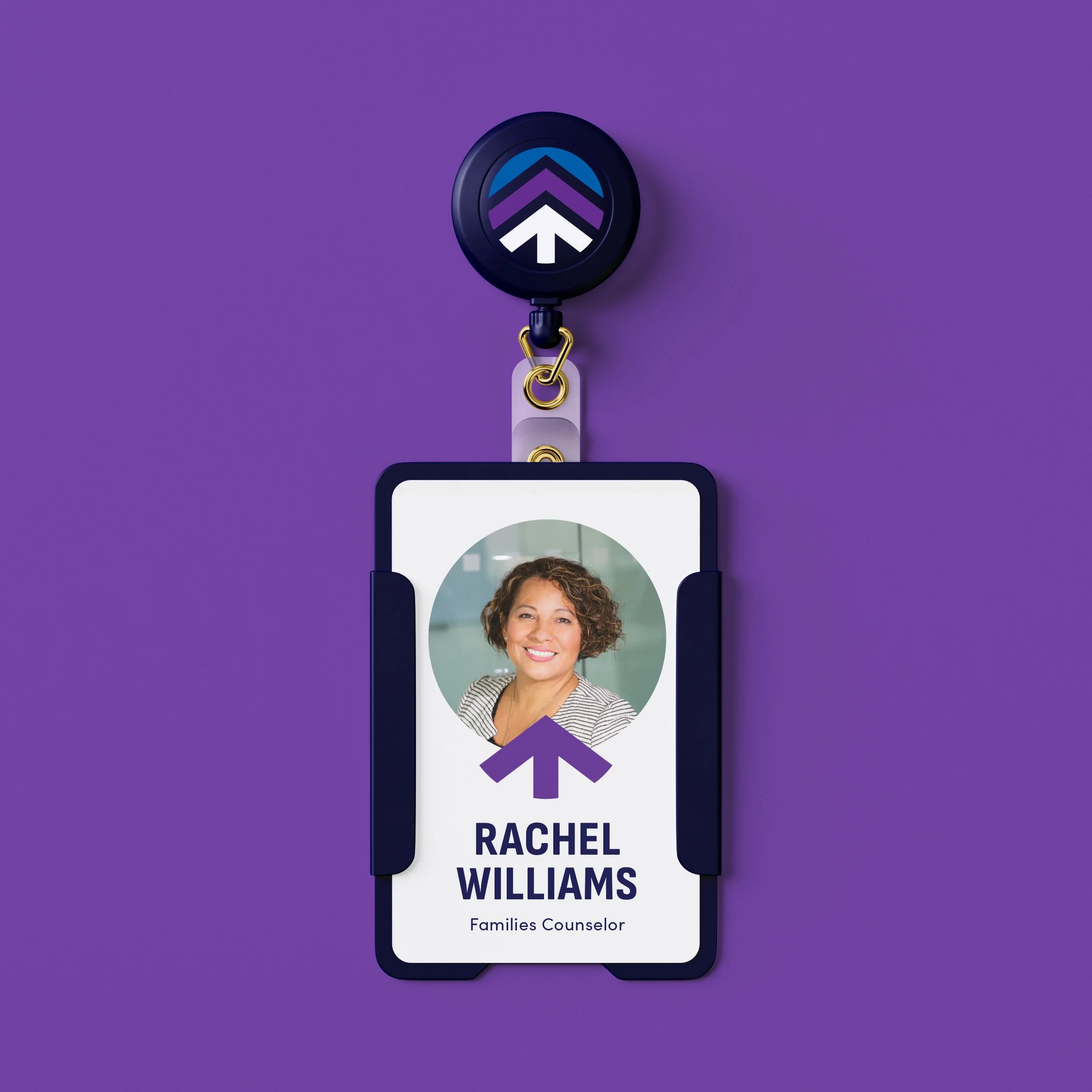
We embraced the challenge of crafting a hopeful and welcoming brand that would not only inspire those connected to the Family Advocacy Program but also keep them motivated in their mission of nurturing healthy communities. The new emblem, internally called 'the Oak', embodies strength, stability, and growth, just like an oak tree reaching for the sky.
The end result was a brand that uplifts both both those providing and receiving support through the Family Advocacy Program. The mark also right in with the USAF and Space Force brands, giving the Program even more credibility and a sense of continuity.
Designed at Fathom Creative
Design & Art Direction: Bethany Whitlock | Creative Direction: Kat Scott | Project Management: Heather Gregg
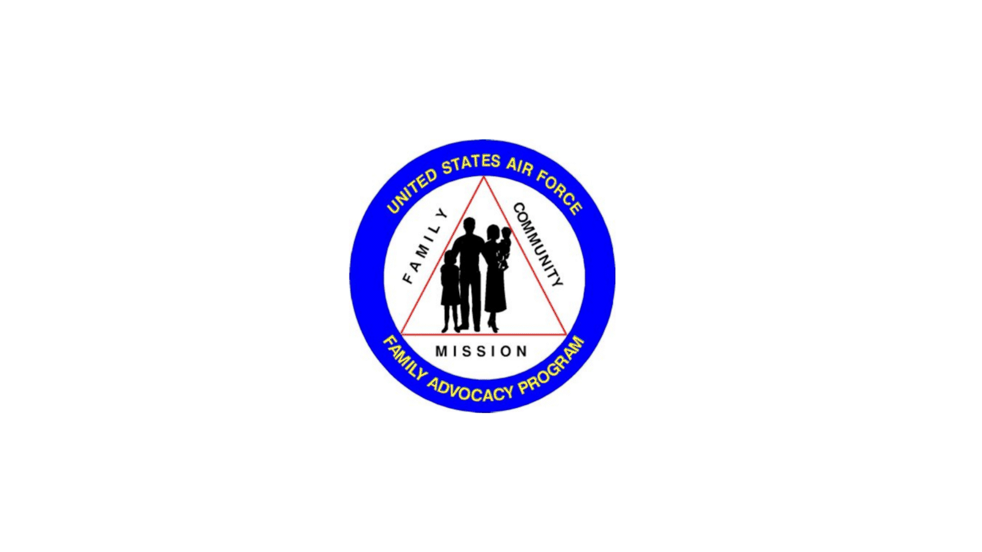


Chief, Department of the Air Force Family Advocacy Program