NAPABA
Event Design | Visual Identity
When NAPABA approached us to spotlight their 35th-anniversary convention, we faced an exciting challenge: honoring this moment for the nation’s largest Asian-Pacific American legal group. Representing 60,000 voices strong, NAPABA unites attorneys, judges, and students yearly to celebrate achievements, forge bonds, and uplift marginalized communities.
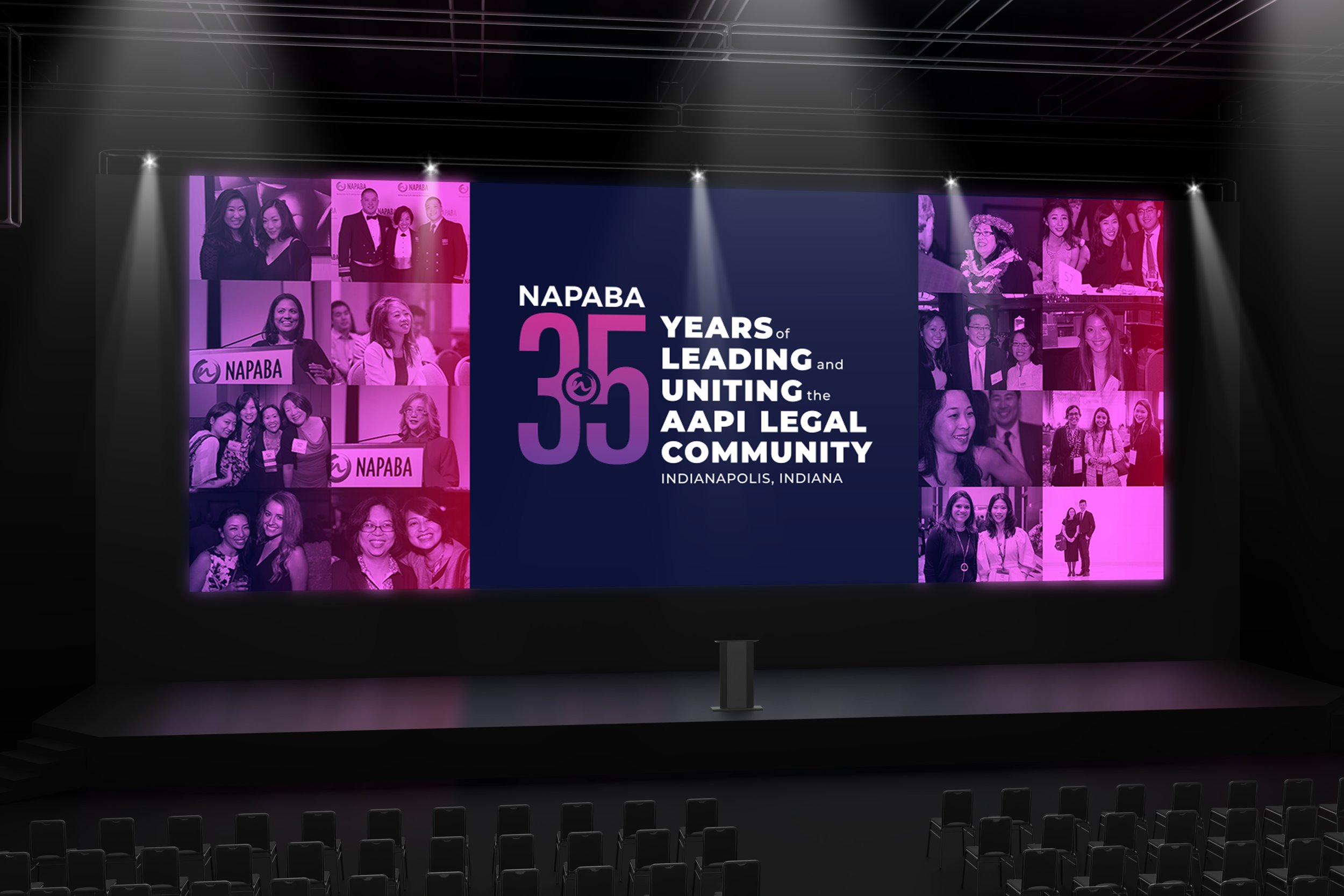
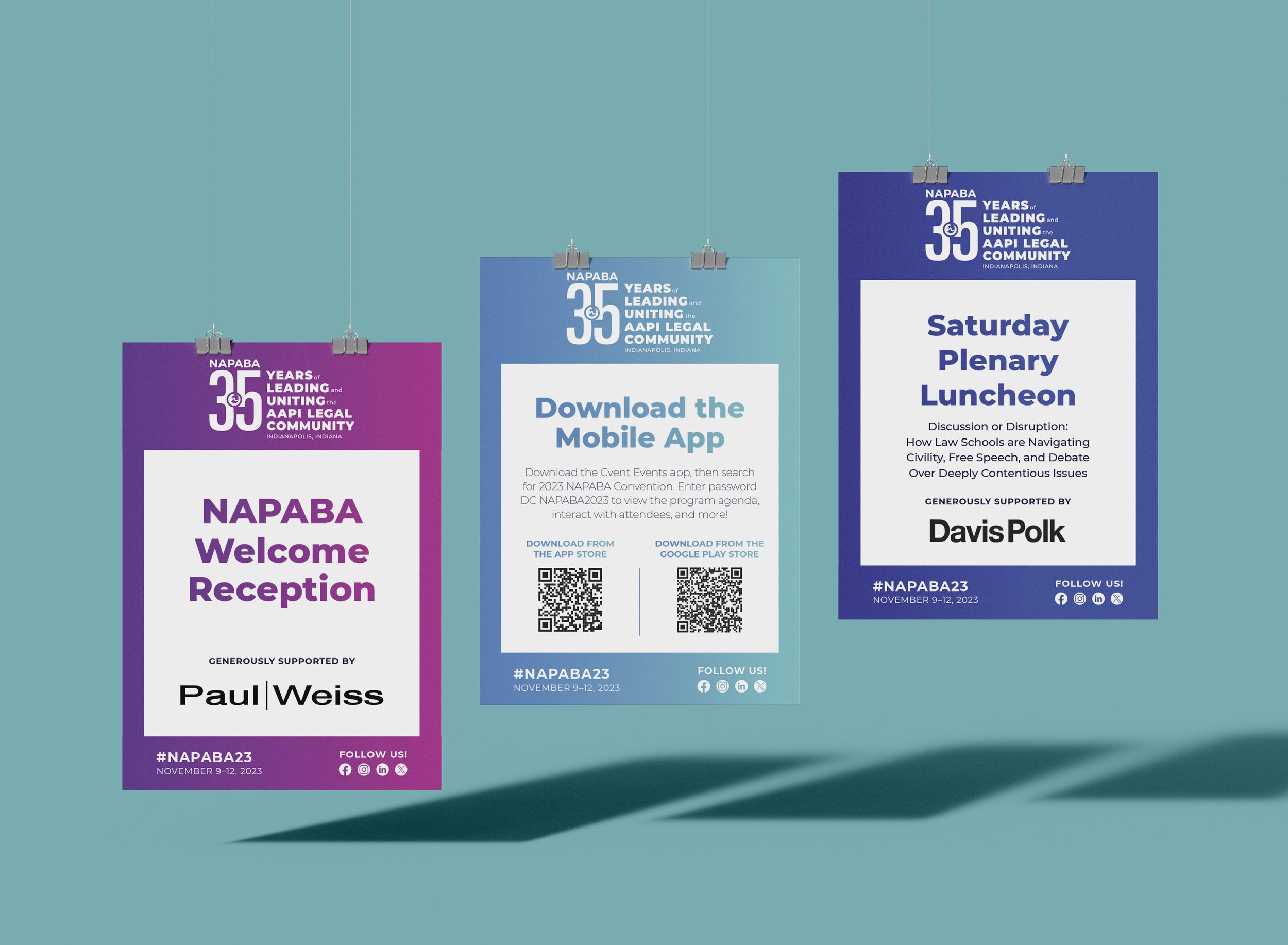
The mirrored the energy of this movement – dynamic typography, vibrant gradients, and photo collages depicted NAPABA’s living history. The end result? An identity as bold and bursting with pride as the community it represents.
The convention’s soaring attendance proved this spark resonates. Over 2,100 legal minds convened, including a remarkable 700 first-timers, reinforcing NAPABA’s role as a forum for unity, empowerment, and building a justice system that leaves no one behind. For 35 years and counting, NAPABA has fought to shape an America true to its promise of opportunity for all.
Designed at Fathom Creative
Design & Art Direction: Bethany Whitlock | Creative Direction: Kat Scott | Project Management: Jo Zhou


Meetings Director, NAPABA
